Do you know 60% of website traffic comes from mobile devices?
The responsiveness of your website is an essential factor in your Google ranking.
In fact, 40% of users have gone to a competitor's website after a poor mobile experience.
Google focus on mobile-first indexing when ranking website. Your website must be user-friendly on a smartphone to get Google's approval.
Websites that aren't optimized for small-screen devices can experience a decline in their search engine rankings. This means they are not getting found online.
How to make your WordPress website Responsive?
There are many ways to make your WordPress website mobile-friendly.
Elementor
Elementor is a free and widely popular page builder for WordPress. Elementor lets you create a custom WordPress theme from scratch without writing a single line of code.
How To Change The Number Of Columns On Mobile in Elementor
How to put 2 column side by side in Elementor page builder is a common question many users ask. Let's uncover it.
What are the uses of creating two columns in mobile view?
- Put your blog post in two columns grid layout.
- For Aligning two videos or images per row on mobile.
Here is the problem:
As you can see, I have two columns with a vertical layout on the mobile view.

Let's see how we can Display 2 columns on the mobile view in the Elementor page builder.
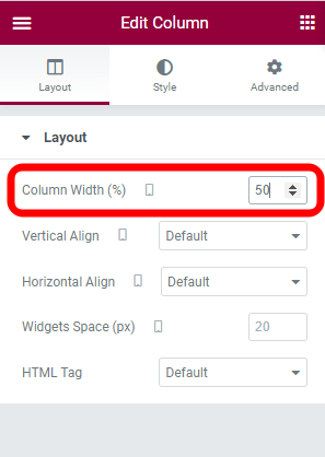
Step 1: After selecting the first column, set the 50% width under the Edit Column tab.
Step 2: Repeat the process with your 2nd column as well.

Boom! I have successfully set the 2 column side by side on Mobile in Elementor by using just simple 2 steps.
At this point you may need to know how space between two column.
Read Also: How to Put 2 Buttons side by side in Elementor

Final Thoughts
Changing the number of Columns on the Mobile is as simple as designing the website using the WordPress top drag-and-drop builder Elementor.
After reading this guide, I hope you can display 2 columns on mobile view—happy learning with Elementor.
